

The Fold Is Dead.

(Originally posted on August 5, 2015)
I want to talk about what phrases like "The Fold is Dead" and "There Is No Fold" mean, why they're being said and how it changes the way we create websites.
Our terminology changes so often, at times, it can be a struggle to stay up to date with new learnings. A little house cleaning can be helpful, and I believe it's time to retire "the fold."
In my work, the term still comes up from time to time. But it's no longer a helpful way to communicate or solve the problems it was meant for.
Origins Of "The Fold"

In the beginning, the fold referenced the prominent crease through the middle of a newspaper. This may seem obvious, but it is essential to understand where it began.
Newspaper editors designed the front page, so the most critical headlines were above that middle fold.
People who walked past the newsstand would be able to see the essential headlines without picking up (i.e., scrolling) the paper.
Why Did We Adopt "The Fold" To Describe Web Layouts?
We were spoiled in the early days of web design. It was easy to rely on users viewing your website with an 800x600 monitor resolution.
If you were lucky, your primary users had 1024x768 resolutions. Still, you had to know your audience to design for that, and it wasn't common.
Mantras are sometimes helpful for following successful techniques. The one I use the most now is "You are not your users." When it has come up in meetings, clients seem to find it relatable. That doesn't mean it will be as helpful in 10 years.
Positioning important content above the fold was a golden rule.
Today it's still used as a reference point, but this type of page organization has a few flaws. Let's examine some of these issues.
Two Reasons The Fold Is Dead.

UX Myth #3 Poster by Zoltán Gócza
1: We Mistakenly Believed Users Didn't Know How To Scroll.
The primary motivation for designing above the fold was the belief: "users didn't scroll." They didn't know how to use the hardware (mouse and keyboard), or they didn't realize the content was off-screen.
If we take a look back, we see something a little bit different than expected.
A study by Jared Spool done 1998 revealed that users preferred scrolling instead of clicking.
It seems unlikely that users didn't know how to use their hardware or didn't want to. How else did they get to your site in the first place?
That leaves us with users not understanding there was content off-screen.
It's my opinion that the problem didn't even exist in the way we think it did.
It was a misunderstanding of what users were trying to do on the website mixed with unhelpful content. Perhaps if we weren't so worried about putting everything necessary above the fold, users would have learned to scroll more often.
2: There Is No Stationary Point To Aim At Anymore.
Fast forward to 2015; mobile is quickly taking over everything. There's no reason to think this trend will not continue.
Thanks to the iPhone, scrolling is now the second or third most crucial user behavior after the tap. With swipe completing the trio.
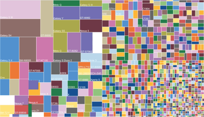
Android Screen Size Fragmentation
The iPhone also dealt the final blow to the fold by leading the way for an unimaginable amount of new screen sizes.
There are so many new resolutions, anticipating where the fold will be on a given device is impossible. There will be more sizes in the future. The image shown above is just Android device fragmentation.
The two conditions that caused our adoption of the term the fold no longer apply, and one may have been incorrect from the start.
What Can We Learn From The Fold?
All along the fold was a tool intended as a guide for effective content hierarchy.
It taught us that the most important and relevant content needed to have the lion's share of focus. However, there are many ways to guide attention to certain areas of a page.
We have also improved our understanding of user psychology.
Following the old rules becomes more complicated when trying to build trust and confidence in a user base.
Positioning a newsletter sign-up field at the top of a page before gaining their trust can harm conversion rates.
It's the difference between a hard sell and a soft sell. But today's customer is faceless and can leave before you knew they had visited. A few short years ago, people didn't shop online much, and many were scared to. In the end, we all prefer being treated like a person, and for that, the soft sell works better.
It's less important that a page element has specific X/Y coordinates than having the page cater to the primary function (i.e., business goal). Sometimes that means the primary action works better below the fold. It can seem counter-intuitive at times.
Since it is counter-intuitive, a page design catering to the primary action is more effective. Sometimes, many times, it means the primary action is above the fold. But that's not because of the fold itself. It's because the user task, user expectation, and business goal were all aligned.
In other words: meaningful placement > immediate/high visibility.
User needs should direct the page architecture, and content hierarchy should enable user discovery.
Information Architecture > The Fold
Since the early days of web design, we've learned that thoughtful information architecture (IA) and clear page hierarchy work better than the fold did.
Where to place elements on a page is part of an IA/UX process. In those processes, the goal is not to put certain items in specific places. It's to lay everything out in a meaningful way.
Term Replacements
While the strategy of the fold no longer works, there are situations where you need to communicate with others that an element being in the immediate view for the user is a core requirement.
The need for describing this is why the terminology has hung around.
With that in mind, the only way to retire the term is to establish a new descriptor.
Some options that I think may work:
Onload View
Default Screen
Window Home
Certainly not as catchy, but the idea is to describe the on load position of the device window—the "start view" of a web page.
This is just a starting point, though, and a discussion on a new term would be helpful.
Summary Of Why The Fold Is Dead:
New devices have made predicting where a user will experience the fold impossible.
Users knew how to scroll all along when the content was helpful.
We have better tools to decide content structure (e.g., user needs, usability, information architecture, journey mapping etc).
To Close, I'll Pose A Question For Discussion.
"Less content above the fold may encourage more exploration below the fold."
— Joe Leech
What if our concern to keep important page content above the fold is what caused users not to scroll?
It's my opinion that designing for the fold was the root of the problem, to begin with.
Users didn't have to scroll; all the important content was above the fold. User behavior developed over time, and we all noticed that nothing of value was ever placed lower on the page. So we stopped looking. Mobile screens are so small that designers have had to accept those important page elements, and the content will be off-screen, and the world didn't end. People still consume the content, if it's any good.
It's safe to retire this term and finally lay the newspaper flat on the table, unfolded.
Food For Thought:
"The myth of the page fold: evidence from user testing" includes some visuals on why the fold isn't what it used to be
Chartbeat has some graphics that show the most engaging region of web pages is just below "the fold".