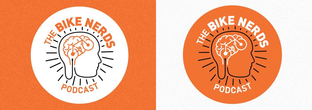
Work: Identity For The Bike Nerds Podcast
This was originally posted on August 23, 2016
About a year ago, my friends Kyle Wagenschutz and Sarah Studdard told me about a new side project they were working on and asked if I'd like to create the logo. Excited to hear about what their project was, I jumped at the chance, and I'm pleased with how everything turned out.
The side project is The Bike Nerds podcast on the OAM Network. It's full of big ideas, community love, star wars, bikes, and other great things.
The podcast is trucking along at full speed with 24 episodes ready for your listening pleasure at the time of this typing. This seemed like the perfect time to share.
Getting Started
Step 1: As with most designs, I started with a sketch. None of which made it to the final version, but it's always good to begin visualizing letters and word groupings that way.
Step 2: Next on the list was to gather content for inspiration. I started doing some color research, looking at how other people had illustrated bikes before and trying to get my head around what the logo needed to communicate.
Step 3: Mockups are the most fun part of the process. My process was to crank out a bunch of versions with minor tweaks as I went along. This preserves early ideas and helps keep you from losing progress or going down a road that sucks with no way to turn back.
The Concept
After sketching and trying a few things, it seemed apparent that a brain and bike belonged together. I wanted to make the brain look like it accidentally looks like a bike, not that a bike outline was just shoved in there. My favorite little part of that is a throwback to the old banana seats many bikes had when I was young.
Brain Stem, Bike Wheel, And Headphones.
I wanted to add some brain stem and noticed that the bike wheel sat perfectly over that area. It also sat where the ear is, more or less. Once the wheel opened up, I thought it looked just like a pair of headphones.
I realized that the headphone chord could turn into the silhouette outline of the person, and that tied everything together. I couldn't have planned all the happy accidents in this logo; they all just sort of appeared during the process.
Type And Colors
Once I was satisfied with the core mark, all that was left was color and type, which didn't take too long.
That's A Wrap
I want to say a big thank you to Kyle and Sarah for asking me to work on this project, for everything they've both done for Memphis and a huge congrats on the successful launch of their podcast.
I encourage everybody to take a listen as soon as possible.


